Sunday, December 31, 2006

Bad Usability: US Airways Flight Status

So I go online yesterday to check on the status of a friend's flight on US Airways' website. We're picking him up, and we want to see whether the flight is early, on time, or late, to adjust when we leave our place to head to the airport.

I click on "flight status" and I get this simple form:
Web form with From, Flight Number, and Depart fields

I enter the flight number, and I click on Retrieve. Then, I get this message:
We're sorry, but we were unable to complete your request.
Please enter a departure city in the 'From' field.
Well, I don't know his departure city. In fact, this is the second leg of his journey, so even if I knew where he was flying out of, I didn't necessarily know his connecting city.

What gives? US Air has the schedule for this flight number. Why doesn't it show me the full itinerary and let me figure out which portion I'm interested in?

Fortunately, Yahoo Travel both had this information and was willing to share it with me. Thumbs down, US Air. You took an obvious task and made it harder than it had to be.

Sunday, December 17, 2006

So Long Bloglines, Hello Google Reader

A long while ago I wrote about using Bloglines to keep up with my online reading. Since then, I've tried to use a few other browser-based readers, but nothing really made me compelled enough to switch. That is, until, on a recommendation from a coworker, I tried Google Reader again. Now, I've switched.

There's a few reasons why:
  • UI - Google Reader looks better. Sorry, but when it comes to spending time with something, I want it to look good. With feed reading, the presentation of the content is important. Would you read a newspaper or a magazine if the copy was not easy to parse?
  • Reading experience - there's one irritating feature of Bloglines that I've never liked. As soon as you click on a feed (or a category of feeds), all the items in the feed are marked as read. Even if you haven't read a single one of them! Google Reader marks things as read as your read them. Just like email. Much more sensible.
  • Importability/Exportability - All of these readers are hot to trot on allowing you to import and export your list of subscriptions. That makes sense for consumers, so you can easily move from one reader to another. This allowed me to switch without having to resubscribe to all of my feeds of interest.
What's ironic is that that last bit is what really made me switch. If I had to resubscribe to all of my feeds, I would say "no way", since I have about 150 feeds I subscribe to. Yet, with Bloglines supporting import/export of subscriptions (as most all newsreaders do), I was able to use this feature to abandon Bloglines. Compare that to Netflix: if they allowed you to easily take your queue of movies to a competitor, how many people would they lose every month?

A last note: Bloglines never approached me for feedback, in the form of a "we care - tell us what you think" link for me to voice the above. There's no feedback link anywhere in their newsreading UI, on last check. Sure, the feedback cycle back into the product isn't instant. But people who are irritated tend to share their thoughts (as I am here).

Of course, I'll occasionally check Bloglines to see if they've improved. With import/export features in all readers, it's just as easy to switch back.

Saturday, December 16, 2006

CEO Harry You Named Time Magazine Person Of The Year

Picture of Harry YouTime Magazine just named their Person of the Year for 2006. And it's none other than Mr. Harry You, CEO of BearingPoint! From BearingPoint's web site:
Mr. You was named executive officer in March 2005. As CEO, he is responsible for formulating and executing the long-term strategies that position BearingPoint as a professional services leader in strategy, business process expertise and technology.... Mr. You is on the Board of Directors of Korn Ferry International, the Dallas Symphony Orchestra, and the Yale Graduate School Advisory Board.
Congratulations, Harry!

Five Ways To Be A Scrooge This Holiday Season

This holiday season, you may be inundated with people spreading goodwill all around you. You know, those giving and sharing types, trying to make the world around them a better place? Well, you can do something about it. Here's five ways to be a true Scrooge this holiday.

Spare change
The holidays are a time to buy a lot of stuff for people who have a lot of stuff. As you rush from store to store in a mad frenzy to buy, you may stop in at a espresso coffee chain and purchase an overpriced holiday latte. If you pay with cash, remember to not give any spare change to those who ask for it on the streets. Just keep drinking your coffee - the steam rising from the cup will fog your glasses so you don't have to look at those who ask for the coins jingling in your pocket.

Leftovers
It's fun to go out to eat over the holidays, as many restaurants have festive menus planned. With the size of entrees these days, it's hard to finish everything you order. Remember to ask for a to-go box, but then ensure you hold on to it tightly as you head back to your car. Even though the food will probably go bad in your refrigerator before you think about eating it, why give it to someone who didn't buy it, fair and square?

Volunteering
It takes a lot of time to get everything done this holiday season. There's shopping for gifts, writing out holiday cards, attending holiday parties...and not to mention the many gatherings with family and friends. Who has time to volunteer for even a few hours at a community food bank, or any number of other non-profits that help those in need? Besides, they hire people to do that work. They don't need extra help nearly as much as you need time to seek out that perfect cashmere top to go along with you new blank pants.

Toys
Every year, it's all about getting kids to go see Santa. You have to find the best place to take your kids to have their picture taken with Santa. Cost is no matter, right? What will the friends and family think if you don't send them that cute picture of the kids screaming their heads off while sitting on a bearded man's lap? While you're waiting in line for the jolly red giant, you may notice some people doing toy drives, collecting toys for kids so they can have a few things to open for the holidays. Make sure to steer clear of that racket! I mean, come on, who do those toys really go to, anyway?

Music
Often times, musicians sing and play instruments on the streets during the holidays, in order to entertain people but also to earn money. It's great that these people want to share their talents with the rest of us, but after a while it can get pretty irritating, can't it? Make sure you never give them money or purchase any of their CDs. There's plenty of places these people can get gainful employment. If they're so into singing and playing music, why don't they audition for the orchestra?

So there you have it - five easy ways to be a Scrooge this holiday season. There are plenty more, so I welcome people's comments on ways they've passed on the grinchy spirit to others!

Friday, December 15, 2006

Seattle Windstorm 2006

Last month was the snowstorm. This month brings a windstorm. And we're not even into the wintery portion of the winter season. What gives?

Seattle weathered the storm in various ways, largely dependent on location. Downed trees and power outages were the primary problems, as were flooding and mudslides. Seattle City Light reported 170,000 without power this morning. And, there were places that felt the effects of too much water falling too quickly. The Seattle Times and PI newspapers couldn't print their dailies because of power outages at the presses. The online editions didn't suffer, however. As for us, the central city was fine this morning, as far as I could tell - no power outages, no flooding.

Redmond and Bellevue were another matter. All of the intersections I went through while driving around this morning were without power, which means no functioning traffic lights. Lots of old trees, fences, signs, and the like were uprooted and toppled. Someone calling into KUOW reported the biggest traffic backups in Bellevue to be because of people lining up for gasoline (2hr waits) or Burger King.

Island County and the Skagit Valley are apparently doing worse than King County. The same situation there: power outages, downed trees, and the like. The problem there is that there's more damage, and people are more spread out, which means it's harder to get power and services back up to a lot of people quickly.

It's been an interesting November and December, from the weather standpoint. Who knows what the new year will bring?

Sunday, December 10, 2006

Christmas Song Lyrics Are Weird

Radio stations like Warm 106.9 are playing non-stop Christmas songs this month, so I've gotten my fill of holiday tunes. But, I've noticed some songs are rather weird, when you really listen to them.

One example is that festive, merry song, "It's the most wonderful time of the year." The lyrics begin:
It's the most wonderful time of the year
With the kids jingle belling and everyone telling you
"Be of good cheer"
It's the most wonderful time of the year.

Ah, yes - what canonical visions of the holidays! But then things get weird:
There'll be scary ghost stories and tales of the glories
of Christmases long, long ago.

What? Ghost stories? Glories of Christmases long ago? What is this, a song about Blackbeard and stories of plundered treasure? War and strife? What gives, song? I don't think I've ever told someone a ghost story over a Christmas gathering, especially having to do with past glories of some sort.

I must be missing the point...who can enlighten me?

Sunday, December 03, 2006

The Darfur Wall

A friend of mine, Jonah Burke, recently launched a web site that smartly combines technology, novelty, and humanitarianism. The Darfur Wall is set up to collect aid money in honor of the victims of genocide in Darfur, Sudan.

The premise is simple: 400,000 gray numbers are on the virtual wall, one for every victim. For $1, you can light one up. From the site:
The numbers 1 to 400,000 cover the 40 panels of The Darfur Wall. Each number represents a person killed in Darfur. By donating $1 or more you can light a number, turning it from dark gray to brilliant white. As we light the wall, we acknowledge the importance of each life lost, we cast light upon a tragedy too many have ignored, and we overcome one barrier to peace.
Better yet, Jonah & co. are paying the costs of running the site, letting 100% of the proceeds go to four organizations which are helping address the crisis in Darfur.

Please help spread the word, and donate a dollar (if not more) when you get a chance.

Bad Video Game Advertisements

Remember those old video game print ads? Remember how bad some of them were? Well, the folks over at 1up.com are doing some round-ups of the worst. What's sad: I remember several of these. Part 1, Part 2, Part 3.

Friday, December 01, 2006

A Second Snow Storm

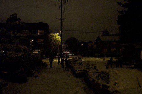
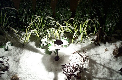
It snowed again this week, this time Wednesday night. A lot of people in the neighborhood came outside around 10pm to make snowmen, throw snowballs, and enjoy the winter dusting that made the familiar look unfamiliar. The snow was transient, however: most of it had melted off by the next morning.
P1002538
P1002535
P1002539
P1002533
P1002532
P1002531
P1002529
P1002527
P1002526
P1002522
P1002520
P1002518

Tuesday, November 28, 2006

Seattle Snow 2006

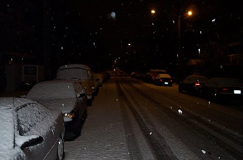
So we had a bunch of snow in Seattle yesterday. A "bunch" here is just a few inches, but with a city that's not prepared, filled with drivers equally so, that can be more than enough to shut things down. And guess what? That's exactly what happened.

First, some pictures (not mine): The fun began in an anticlimactic sort of way. On Sunday night, the weather reports were wishy-washy. Would we get snow? Would we not? No one was sure. Turns out that we did get some, but it melted before the morning commute was underway. During the workday, snow would intermittently fall, but nothing seemed to stick. People gazed at the snow outside of their windows, and then got back to work.

Then, around 5pm, the bottom fell out. Tons of snow started falling, and sticking. Cars filled the streets and packed down the snow into sheets of ice. Soon, cars were spinning out and traffic came to a halt. On the way out from work, I helped push a car that was having trouble climbing up a rather shallow hill. Looking back, I saw a long lineup of cars waiting to meet this same hill, one after the other. I didn't stick around to see who else would end up being stuck.

I thought I was being smart by taking the bus in the morning. "Surely," I thought, "surely the buses will be prepared to truck folks home in this inclement weather." The short answer: they weren't. The buses didn't have chains on them, and it took hours to deliver the chains to the buses before they could commence their trucking.

After about an hour and half of waiting outside in the cold, snowy weather, a generous soul came by and offered a ride to those going to his neighborhood...my neighborhood! I hitched a ride along with two others. Fortunately the guy had a 4-wheel-drive car, so I felt pretty good about our chances of getting home without incident. Now, you'd think that we'd be home in no time, right? Wrong. It took 30 minutes to get from the parking deck to the highway, all because of traffic jams. Once on the highway, things were eerily fine; sure, there was snow on the road, but there was very light traffic. We arrived in our neighborhood about 15 minutes after hitting the highway, happy to finally have returned home.

Sound bad? Actually, we were some of the more lucky commuters yesterday. Another guy on my team took 4 hours to get from work to home (a trip that likely takes 20 or so minutes, usually), in large part to the other drivers who couldn't navigate the snow and ice. Even worse, I heard of one person who lives in Lynnwood that left work at 5pm, and arrived at 4am. That's right - 11 hours of wintery commuting hell.

The moral of this story? The only one I could glean was: at the sign of a snowstorm with accumulation, leave early. Someone that left before the 5pm downpour got home in a matter of minutes. Ah, hindsight: I shake my fist at thee!

Sunday, November 26, 2006

Seattle Toll Study: Don't Mix Apples With Oranges

The results of a recent transportation study were reported on last week. The study involved 275 households being given a pre-paid "driving" account, which was then deducted from based on where and when people drove. If drivers had leftover money in the account at the end of the month, they kept it. The result: people drove less.

Great! But what I fear is an apples-to-oranges translation of this study's findings to defend a traditional toll plan in our region. And I don't think the translation holds water.
  • The study had people starting with extra money they didn't have. The incentive was "drive less, and you get to keep some of this money." Toll systems are closer to "have the same as you did before, but now pay up to drive here." That's just not the same.
  • Certain roads around the region are in very high demand during peak hours. The SR-520 and I-90 bridges across Lake Washington are two great examples. Because of this demand, I believe that, unless you charge exorbitant tolls, most people will continue to use these roads (decreasing the value of a toll as a way to reduce traffic).
  • I'm not a fan of tolls costing people of different means and income the same amount. People making $20,000, $200,000, and $2,000,000 annually, and having to pay the same amount to cross a bridge daily, means that the $20,000 person feels a much bigger impact on their bottom line than the other two people.
So, let's implement a system that takes advantage of the study's findings, and addresses some of the disparity issue.

First, let's actually implement a system similar to the one in the study. People get an account (funded from a portion of the transportation budget) that they can draw from when they drive. If they don't spend it all in a given month, kick it back to them (or let it rollover to the next month, at least). The lure of "free money" to cut down on unnecessary trips, or to carpool, will be high.

Second, make tolls proportional to the car being driven. Yes, a person crossing the 520 bridge in a car worth $3,000 should pay less than a person crossing it in a car worth $30,000. To put it another way, don't make the person with less means pay the "full price" of the toll.

Third, make the toll rates simple and easy to understand. Don't charge a toll on every road driven. Make it peak time. Make it only on the roads where you actually want to reduce traffic. Make it easy for someone to understand what & when they pay.

Finally, make the system accessible to all. If folks don't have or want the "deduct from the account" system, or other automatic way of paying the toll, offer other ways to collect money for the peak roads and times (cash, for example). Don't penalize visitors, and don't penalize those who don't wish to sign up for an automated account.

Yes, Seattle has a traffic problem. Yes, tolls are a tool to help address the problem. But let's use this study as a springboard to think about new, creative ways of applying tolls, instead of falling back to something convenient, tested, but not necessarily great.

Saturday, November 25, 2006

Uncle George

It's official, you can now call me Uncle George (or Barba Georgis, if you're Greek): we have a niece! Zoe Grace was born early this morning, to my relieved-sounding and happy sister and brother-in-law. She came practically right on time (her due date was tomorrow).

We wish we could be there, but technology will have to bridge the distance for now, until next month. We already have one picture, courtesy of a camera phone. I'm sure we'll have many more (and videos too!) after the holidays.

Now, how shall I start to spoil this niece of mine? Hmm...

Thursday, November 23, 2006

No Amazon XBox Deal, And Uncool Consolation Prize

OK, so I didn't get Amazon's $100 XBox 360. Nor did seemingly 99.9% of digg readers who are posting their complaints about Amazon "crashing" or otherwise exhibiting high latency.

I did get a claim code for the Mongoose mountain bike for $60. But I already have a bike. Oh well. Anyone want it? If so, contact me (zorbadgreek a-t yahoo d-o-t com). Note it expires tomorrow, 11am.

Categories, Categories

Administrata: So I switched to using categories to tag posts based on their topic. This means more category pages, and pages that are easier to manage. You'll find the category views as links at the top of the page.

OK, back to your regularly scheduled blog.

Sunday, November 19, 2006

Coco La Ti Da

We checked out Sue McCown's new restaurant-meets-dessert-bar, Coco La Ti Da, last Saturday. I was disappointed a few months ago when Fork unfortunately closed, so we were eager to see what the new place was like. Fortunately, we encountered a restaurant that teems with energy, friendly staff, cozy tables, and really, really good desserts.

Coco transformed the dark, brown interior of Fork into a brighter, more whimsical space. While the mural on the walls is preserved, new lighting has been added, and some of the furniture has a more retro-modern bent. The far room has become a sort of lounge, with three couches, small tables, and curtained walls and ceiling. In front of the kitchen is the dessert bar, displaying some of Coco's recent creations for to-go customers.

After a few minutes' wait, we were seated in the far room and were immediately greeted by a friendly waiter. I counted no less than 6 staff (not including Sue) present on Saturday night, each buzzing around, describing dishes to customers in a friendly manner or making order suggestions. The staff seemed quite knowledgeable about the dishes, and were eager to answer questions about the menu.

While the place does serve many savory dishes, we went straight for the sweets. They come in three varieties: plated versions (centerpiece desserts with sauces and powders that surround it on the plate), baby cakes on a stick (just what they sound like), and mini parfaits (tall shot glasses of layered goodness). We ordered a small French Press coffee, a plated Coco La Ti Da (their namesake), and a couple of the mini parfaits.

The pastries are not large, but they make up for their size in creativity, flavor, and richness. You're getting a fairly gourmet experience here: the desserts are creative, the ingredients are unique, the presentation is attended to, and the overall balance of flavors and textures is certainly considered. And, with a large enough party, you can sample many sweets and not fill up too terribly much.

Service was pretty spot-on; we didn't see any mistaken orders delivered around us, and there was only one mix-up at our table (they accidentally brought two Coco La Ti Da's - I now curse myself for rejecting them).

As for price and atmosphere, Coco is somewhere in between everyday place and special occasion. It's a great weekend-evening-after-the-movie-or-show kind of place, but you don't have to get all dressed up to go. We were quite comfy in our jeans, and many others were as well.

So, I'm sad Fork's gone, but I'm happy with what filled its place. Go visit Coco, talk to Sue, and enjoy her culinary creations.

Wednesday, November 15, 2006

Dear Clearwire, Please Stop With The Light Show

Dear Clearwire,

It's cool and all. You're allowed to set up shop in Seattle and sell your wireless Internet service. That's fine. But what's with the laser light show on the Space Needle tonight? I mean, come on, the disco light effects alone were pretty disturbing. And, considering the storms we've been having, I'm sure several people mistook the lights to be some sort of interstellar distress signal.

So, Clearwire, please stop with the light show.

Oh, and by the way, no one's going to switch to your service until you either a) make it cheaper and faster than cable or DSL, or b) don't require people to carry around a book-sized modem with them wherever they want to connect.

Thanks,
--George

Sunday, November 05, 2006

"The Stranger"'s Terrible Election Endorsement

As most people know, next Tuesday is mid-term election day. It's a journalistic tradition for newspapers to endorse candidates and propositions on the ballot. One of Seattle's major free weeklies, The Stranger, has done just that. And, while most of their endorsements are fine by my book, one really stands out as, well, just plain bad.

Here's the background: the 43rd district in Washington State includes some of the more liberal portions of Seattle, which itself is a fairly liberal city. For a while now, Ed Murray has been one of the Democratic representatives to the state House for the 43rd. For 2006, a seat opened up in the state Senate, and Ed Murray decided to run for the seat (which he'll most likely win). This means Murray is vacating a House seat, which will almost surely go to a Democratic candidate.

Our primary last September pitted 6 Democratic candidates against each other. The result was Jamie Pedersen edging out Jim Street and 4 others for the nomination, with 23% of the vote. You could argue that 77% of the Democratic voters were disappointed, but you can also probably bet that most of those voters will vote Pedersen in.

Enter The Stranger. From their election endorsements:
Admittedly, there is one Republican we just can't resist endorsing. In the 43rd District race our Democratic candidate of choice, Stephanie Pure, was eliminated in the primary. As a consequence, the state legislature will once again lack a voice for today's youth. Which is why we're issuing a rare Republican endorsement: vote for Hugh Foskett, the Republican running against Jamie Pedersen for this open seat in the Washington State House of Representatives. Foskett is a sophomore at the University of Washington and, as we've seen over the last few weeks, Foskett is quite literally in touch with today's young people.
Wait, Stranger, you're endorsing a Republican college student? For one of the most liberal districts in Seattle?

I don't want to marginalize Foskett, but he's a sophomore math major at UW. He doesn't appear to have any background in public service (at least, his web site and voter pamphlet statement don't seem to indicate any). He's running on two issues (education, environment) with fairly generic positions. And, for the sake of argument, if he's elected, will he just drop his studies when Olympia is in session each year?

Pedersen is a lawyer, active in many local organizations, and has worked for marriage equality and GLBT issues. He's not my ideal choice, as I believe he's less progressive on issues outside of the GLBT space, but he's the best on the ballot in my opinion.

Since The Stranger's pick during the primary, Stephanie Pure, didn't get nominated, why not recommend that people write her in? Isn't that the best way to cast one's vote towards the person who one feels is best qualified?

Sunday, October 29, 2006

I'm Fed Up With Political Ads

The November elections are but days away, and while I know how I'm going to vote, I also know I'll be entering the voting booth with tense shoulders, a headache, and a sneer on my face. The reason? Political ads. They're everywhere.

They show up in my mailbox, as printed multi-color cardstock ads. They appear as pre-recorded messages on my answering machine, from people who I think I'm supposed to relate to, or otherwise trust the opinion of. They appear on television, with large red titles, slow-motion video, and voice overs more appropriate for thriller film previews than anything else. They appear as signage on the side of the road. They even appear online, when I browse to local sites like the Seattle Times, ironically while reading an article about online political ads.

It's sad that there's a drag-race of sorts in the arena of political advertisements. Clearly campaigners must have evidence that these ads work, so they're pouring bucketfuls of money into all these channels, in an effort to sway the handful percent of undecided voters. And, most of the ads lately are much more in the "mudsling" camp, spreading fear, doubt, and uncertainty over anything else.

All I see in the ads is fear: fear that social security will be taken away, fear that terrorists will attack us, fear that immigrants will steal our jobs, fear that the economy will head south, fear that liberties we enjoy today will be gone tomorrow, fear of change, and fear of no change. Yes, we elect people to do certain things, and take certain stands that we want them to. But, I'm hard-pressed to find another job that someone has to apply for that depends so much on spreading fear about what would happen if the candidate was not elected.

So, until election day rolls around, I'll be shutting my eyes and plugging my ears next time I see or hear one of these ads. I've made up my mind as to how I'll vote, and I've done so without these multi-million dollar ad campaigns.

Sunday, October 22, 2006

To Seattle's Metronatural, I "Say Wa?"

Not long ago I commented on Washington State's Dept. of Trade and Economic Development's Say Wa? Slogan. You know, I thought that would have been the only stuff about bad slogans I would have had to post. I guess I was wrong.

The geniuses at the Seattle Convention and Visitor's Bureau have spent $200,000 on Exclaim and 16 months to come up with an attractive slogan, to convince tourists and conventions to come and visit Seattle and spend their dollars here. The result?

Seattle: Metronatural

Oh my...

Plastered all over the Visit Seattle web site, the new slogan aims to elicit the combination of urban metropolis and natural beauty that exists in our city. I can't help but think of "Metrosexual" when I hear the word. And I'm sure a lot of others can't, either.

OK, great, fine...but what was wrong with Emerald City to do that? "Seattle: The Emerald City". Emerald, you know: green, for trees and plants and such. Perfect, right?

Here are some other fine ideas:
  • Seattle: Please don't hate us because we're beautiful
  • Seattle: Not as close to North Korea as you might think
  • Seattle: Also a gateway to California!
  • Seattle's awesome! It has lots of coffee!! OMG!
  • Seattle: We still care about parks and stuff
  • Seattle: Safer than Detroit, prettier than Des Moines
One positive note in all this naming mess: according to an article, Seattle's old travel-friendly name was Sea@L. Um, yeah, that one's pretty bad, too.

Thursday, October 12, 2006

Seattle Fire Department Ignores Web Accessibility

For a while now, the Seattle Fire Department has been hosting a service that shows you real-time calls that are coming in. Well, recently they switched their "latest calls" view to be an image. John Eberly writes up the before and after and talks about the consequences.

"What's the big deal?" you may be wondering. Well, for starters, images are harder to process than text. You can use Optical Character Recognition (OCR) technology to convert the textual information in the image to actual text, but that's a bother and not guaranteed to be 100% accurate.

But there's a worse consequence: images with information, without text alternatives, aren't accessible. In other words, blind or low-vision people can't read this information anymore.

Yes, we have laws and regulations to prevent this. I'm surprised that the SFD decided to ignore these precedents when changing to an image. It's a change that is very easy for someone to workaround who really wants the information in a computer-processable way, but penalizes those that browse with screen readers who are simply after the information.

On John's advice, I've sent mail to the Seattle City Council and the SFD chief. We'll see what their response is.

Wednesday, October 11, 2006

The KUOW Fundraisers Are On Drugs

Let me explain.

Wait, first let me share that I'm a member of KUOW, which means I give them money because I think they provide a great resource of news, information, conversation, and entertainment. I totally understand the need to do fundraisers, as half of the station's money comes from individuals and foundations. So, yeay to KUOW and yeay to raising money.

Now, let me explain what I mean by "on drugs". In the span of a couple of days, I've heard the following:
  • John Moe singing the music from Marketplace that they play when they "do the numbers", to signify that they're raising money. Then, transitioning to a fellow fundraiser singing while John pretends to "do the numbers" and report how the donations are going for that hour.
  • Stories about how the pledge "premiums" have special magical powers. For example, the knit cap traps your thoughts and prevents them from leaving the vicinity of your head.
  • Getting really really excited about pledge gifts' innate abilities. The adjustability of the messenger bag shoulder strap was mentioned with glee and feigned disbelief (aka "Shut Up!").
  • Hyperactive reactions to phone calls being made to the pledge line while the fundraisers are on-air, such as "...and call in [phone rings], just like that person, yeah!, and donate to..."
  • Goal math gone bad. I heard John today say something like, "If one person donates $5,260 dollars, we'll make our goal for the hour!"
More often than not, the on-air pledge drive sounds like it's reported by over-energetic, ADD people who are quick to go on a tangent on any old topic that crosses their minds. I'm sure the on-air fundraising isn't very fun, and hats off for sticking with it. But why does it have to sound like everyone's always high?

Tuesday, October 10, 2006

How We Ship Office and Windows

The New York Times has an article on how the Windows and Office teams at Microsoft are spending their last weeks in the product cycle getting their respective products ready for customers. While it's only a slice of the work the teams do here, it is a fairly accurate picture of the "endgame" of a software product cycle, at least in my experience.

Plus, it's fun to read articles which name people that you know, or get emails from, or both.

Saturday, October 07, 2006

Always Documenting, Never Reading

I'm impressed by the number of ways there are to catalog one's experiences. There's Flickr for the photos of the recent party you visited last night. There's YouTube for posting videos of your pets doing funny things. Then, there's plenty of sites with user review sections like CitySearch where you can write a review of the new Thai restaurant you visited last week. There's forums like Craigslist where you can discuss the ins and outs of your hobby. And, you can journal your day-by-day life on your weblog, your video blog, and via podcasts. Heck, there's even ways to quickly record every thing you do in your waking life, with a mobile device and a service like Waymarkr.

With all of these cataloging options, where or when do you stop and read the information, not just your own but from others? I don't consider myself a proficient poster, yet I'm perpetually behind in reading the feeds I'm subscribed to in Bloglines (much like the stack of New Yorkers that taunts me from my bedside nightstand). With a handful of proficient posters' accounts, I don't see how someone who regularly records their thoughts, pictures, and videos online has time to read and view them all, and still have time to live the very life worth cataloging.

A big thing in the business world these days is roll-ups, or dashboards. Quick summaries of lots and lots of business data (sales, earnings, traffic, feedback) in easy to consume charts, graphs, and green/yellow/red key performance indicator displays. This approach (with the right heuristics behind it) can tell you which region is suffering with low sales, or which the most efficient factories are, or what the highest-reviewed product is, at a glance.

The world of blogging could take a page out of this book, and produce a way to view someone's collective blog/picture/video/audio output in one view. The idea isn't to zoom out to the point of seeing detail-less thumbnails and abstracts of what people are posting on their blogs, but instead to help me quickly see the salient bits of what someone is thinking, doing, and cataloging, and to help me focus in on what I want to read.

Not a month goes by without some newspaper, magazine, or blog writing about information overload and information management. Typically, solutions are along the lines of partitioning time and information, in order to see and deal with less at one time. I'm of the opposite belief; more information is great. Just give me a zoom slider so I can spend less time figuring out what to read or view, and more time reading and viewing it.

Sunday, October 01, 2006

The Red Line Is No More

While driving by the corner of Olive and Denny recently, my eye spotted something different inside The Red Line, those purveyors of tasty sandwiches and pizzas. Sure enough, the place was undergoing some interior decoration changes, and a sign was up on the window:
Coming soon: Amante Pizza & Pasta
Immediately, scary thoughts crossed my mind. No more Red Line? No more coffee, pizza, and espresso within walking distance? No more Oscar parties? No more friendly staff and customers that you recognize from visits past?

In doing a little research, the Seattle PI seems to have the scoop. Apparently owner Katy Carroll has decided to call it quits (her partner, Derrick Aiona, left some time ago). Amante Pizza & Pasta is a local chain, which, as the name implies, is mainly focused on the pizza/pasta trade.

Now, that's the bad part. There is a good part. According to the PI article:
  • This particular Amante will continue to serve Red Line's sandwiches, coffee, and free wi-fi.
  • The place will be open 24 hours.
  • A bar will be added.
Well, I'm now down from "severely disappointed" to "hopeful". Katy had a great thing going with The Red Line, and I'm sad to see her go. But Amante seems to be catering to local preference in keeping some of Red Line's signature dishes and coffee-shop-feel in place.

I'm anxious to see who wins: local preference (assuming people still dig Red Line's sandwiches and coffee) versus chain uniformity (repeat after me in a monotone: "Everyone must serve the same. We must conform"). I'll report back once we visit the place, but if someone beats us to it, let me know how it was.

Saturday, September 30, 2006

Back From Atlanta And Florida

Yes, we're back from our trip to Atlanta and the Florida Keys. The weather was great (though a bit hot and humid at times) and we have lots of stories to tell. No rain (fortunately) during our big day, and no hurricanes to speak of during our tropical vacation. I'll post some pictures (and maybe even a video or two) in the coming days.

Most of you probably know why we were traveling, but if you don't, well...I'll let you guess.

Sunday, September 10, 2006

When You're Completely Out Of Song Ideas

Well, then you write a song about an IRC bot that's not really a bot at all. Basshunter's song Boten Anna is just that.

For those who don't know what IRC is, or what bots are in that context, don't worry. I assure you it's extremely geeky and not worth your time to learn about only to appreciate this song.

Saturday, September 09, 2006

Sound Transit's Got A Plan

Three plans, actually, for what to do with mass transit in the Puget Sound region, over the coming couple of decades. They've compiled some nice interactive maps that describe the plans in detail. And, they're asking for feedback, in the form of an online questionnaire, email address, and meetings.

If you live in the area, go and review the plans and offer your opinion. It could very well affect how people get around our corner of the country for years to come.

Monday, September 04, 2006

Weekend Hike To Snow Lake

Last weekend we took a hike (literally) to Snow Lake. The weather was warm but not too hot, and we decided to get outside for a while and enjoy nature for a change.

The Snow Lake hike is relatively close to Seattle; a 52-mile or so drive will get you to the trailhead. And, at 3 miles round-trip, it's a relatively short hike, and is good for an entire morning or afternoon. As for difficulty, it does ascend quickly near the end, with a set of switchbacks amidst a gravelly, dusty trail. But after that, a great view of the lake and a short jaunt downhill await you before you arrive at the cool, clear water.

Pack sandals and a bathing suit to enjoy a dip in the lake after the hike. And, remember your water and some trail mix for the ascent.

Here are some pictures of our excursion:
P1002370
P1002376
P1002379
P1002380
P1002381

Wednesday, August 23, 2006

MySpace: Where HTML Finds Its (Questionable) Roots

Back in the day, when the World Wide Web was young, and HTML was still new on the tongues and fingers of many a web developer, web pages sucked. They looked bad. Bad color combinations. Bad layout. Bad usability. Let's not even talk about accessibility. Back then, it was friggin' cool enough to see a web page render on your screen, click on something, see something else load, and all that with images and text and such. It sure beat terminal graphics on the Legend of Red Dragon door, courtesy of your local BBS! Who needed good looking pages when the thing did what it did, when it did?

Slowly but surely, people woke up to the fact that web pages needed to be more than dancing bears. And, patterns and practices emerged. Navigation across the top or left. Logos that link to the home page. Text that wraps around images in a column. Decent color combinations. Alt text and tab order. In short, people figured out how to make fairly decent looking, usable web sites.

And then came MySpace, and with it came tools to help you customize your MySpace profile. And now we're back to where we started.

Here's apparently how you make the most bestest MySpace profile ever:
  1. First, make sure you have a busy, static background image with a color similar to your foreground text. Or, if you'd like, an animated background image will do the trick.
  2. Next, fill your profile with lots and lots of animations. More, seriously. Keep adding them. There's no limit.
  3. Now, make sure you have plenty of color variations in your text, to ensure people have maximum trouble reading the content that you spent so much time crafting in your profile.
  4. To keep people interested, and to think that you're clever, make sure you post some of your latest quiz results for all to see.
  5. Finally, if you're concerned that your content isn't up to snuff, just use a font that no one can read. It's OK - that background song will convey your message just fine.
"Aw, come on, George. People are just having fun customizing. It's their space on the 'Net, and they can do what they want, right?"

Hey, I'm all for personalization. But there's a line between personalizing your presence on the Web and making it look plain awful. I consider the Web a source of lots of information (some factual, some opinion, some personal, some funny, some crude). But if the medium with which this information is conveyed involves flashing marquee neon purple text on a dark purple background, songs like The Chicken Dance playing in an endless loop, and an animated cursor trail stating "BCHS 4EVER!!!@!", then count me out.

I wish MySpace would draw some sort of middle ground, with pre-built templates that are customizable to some extent, without letting people delve into the RGB mismatch, static background abyss that is bad Web design. Yes, personalization is cool, but please don't make me want to plug my ears and shield my eyes as a result.

Sunday, August 20, 2006

The 5 Spot Visits Alabama

Attention, Southern transplants and South-o-philes: venerable Chow Foods' The 5 Spot has flipped its seasonal menu as of last Wednesday, and they're now onto none other than "Sweet Home Alabama".

We've only been twice (only?), once for dinner and once for brunch, and can say that they've hit the mark with their Alabama-inspired menu. The cornbread, crawfish, grits, and stuffed chicken are all excellent. The best part: 5 Spot has mixed in some fall tastes with their down-home cooking, which means we'll get to enjoy this comfort-food menu as the days grow shorter and the temperatures cooler. Oh well, at least we'll have some culinary consolation.

Yakima Valley Wine Country

Last weekend we took a trip out to Yakima Valley to check out some familiar wineries as well as experiment with a few new ones. The weather was nice and not too hot, and the wineries were hopping as a result.

Overall, Yakima Valley wineries are booming. Several that we visited a few years ago that seemed small and quaint at the time have now built new buildings, expanded their facilities, and "glitzed up" their appearance. Of course, you always had the glitzy ones, and you still have the mom & pop ones. But in general, the movement seems to be towards the bigger and better (and, I hate to say it, just a touch more Napa/Sonoma). Fortunately, most tastings are still free and most makers are not snooty when it comes to sharing their wine with you.

Here's a few highlights (and lowlights) of the weekend:

Hyatt Vineyards - Our perennial favorite didn't fail to please. Several great wines at very reasonable prices, with a pleasant area outside of the tasting room to picnic, relax, look at the vines, or stare up at the windmill that graces their wines' label. We stocked up on a few bottles of the Black Muscat while there, which is an easy-drinking semi-sweet red.

Kiona Vineyards - I claim this is one of the best wineries in the region. One gets a very mom & pop feel as one walks into the basement of a house, which is the tasting room + gift shop. Kiona produces well over a dozen wines, each of them ranging in quality from great to amazing. Their dessert wines are especially good, with honey-like, creamy qualities.

Agate Field Vineyard - A relative newcomer under this name, but an experienced grape-grower and vintner nonetheless. Owner Ben Rashford is focusing on producing small runs of really good wine. They have two for sale and for tasting, both red, and both smooth and rich.

Seth Ryan Winery - Wasn't very impressed with Ryan's wines. Ironically, the cheaper ones were better than the more expensive, with their most expensive 1999 Jessica Meritage being the weakest. Too tangy and imbalanced, I suspect the proportions of the 5 grapes used for the mixtures to be the culprit.

Paradisos del Sol - One of our old favorite wineries left us with a (metaphorical) bad taste in our mouths in our most recent visit. The wines haven't changed that much (decent to quite good), but the experience in the tasting room was less than stellar. We were helped by a young woman who seemed more interested to tour her knowledge and her "way of doing things" than help us taste the wines and answer our questions. No, you can't rinse your glass. No, you can't taste that dip since we've moved on to different wines. Oh, and let me talk bad about the large party that was in here before you all. Watch the customer service in your tasting room, Paul!

Terra Blanca - A decent winery that's gone off the glitz end. A very large new building, built in the rustic Mediterranean style, has taken over their property. This was one of the more "Napa"-esque wineries that we visited, and we lamented at the loss of their previously quaint feel (not two years ago we picnicked on their lawn - now one feels like they may ruin their manicured lawn if one sits on it). The wines were good, but a bit on the spendy side for the quality.

Horizon's Edge - Come on guys, why are you not willing to offer at least some of your wines for free tastings? Nearly all of your competition does. Oh well, no thanks, then.

Monday, August 14, 2006

Hey, I Know That Journalist!

I was reading up on some news over the weekend, when I ran across this article about the Ludwig von Mises Institute. I then look at the author's name. I do a double-take. "Kyle Wingfield," it reads. I quickly realize this is the same Kyle I went to school with back in Dalton. Hey, go figure!

What's funny is that I discovered this thanks to someone posting it on digg.com, and then several people having dugg it. Thanks, community news sites!

Sunday, August 06, 2006

Dixie's BBQ Is More Show Than Substance

The Seattlest blog recently wrote up a favorable post on Dixie's BBQ. I don't think seattle_leora is very up on BBQ, as the review is written in a very wide-eyed, 1st-visit, "WOW!" sort of way. Sure, everyone's entitled to their opinions, but I don't think Dixie's is "divine", "fabulous", or "succulent". I'll use an interview with Dixie and Gene Porter to comment on a few points.
  • Popularity: I think Dixie's is popular because they have a gimmic: a very hot sauce called "The Man". That, plus the fact they're close to places of work where people can steal away and get some lunch. That, plus the fact they like to heckle their customers and threaten them with the sauce (which admittedly is fun to watch newbies experience). "We've never advertised" isn't entirely true, either: Dixie's has plenty of bumper stickers and other articles with their logo, and their catering truck is branded as well.
  • Other BBQ restaurants: "They don't know how to cook," you say? "Too tough." Excuse me? Dixie, the last few times I've been in your restaurant, your BBQ was too tough. The ribs were slathered in an over-cooked sauce, the meat was too fatty, and the chicken definitely was not tender and falling off the bone. Have you checked out places like Steel Pig or Bourbon & BBQ Grill? They top your food's quality, plain and simple.
  • The Man: Gene claims that "heat" is the main ingredient. A friend mentioned that it's somewhat similar to one of Dave's Insanity sauces. It's indeed quite hot. And, the fact that Gene puts it on your food as a test of masculinity and resistance to heat is a bit of a tired custom, if you ask me.
And here's where I get to my main point: when people talk about Dixie's BBQ, more often than not they talk about The Man sauce, or how you'll get heckled in line if you don't know what you want, or how you'll get asked to put a pin on the map to show where you're from. Not that the food is great. It's about the show, the experience, and not about the food.

I'm a big fan of BBQ, and I'm happy Dixie's is open and does good business. After all, one more BBQ place open in a region that has little history in the cuisine isn't a bad thing. Their food isn't bad, but it's not all that great, either, especially when compared to other local options. You can keep The Man, Gene, and I'll pass on your BBQ, too.

Tuesday, August 01, 2006

Good Places To Be Right Now

I see about three:

Weather map of continental United States showing high temperatures.

I'm glad I'm in one of those right now.

Friday, July 21, 2006

Cupcake Royale Has Raspberry Cupcakes

Yes, for a limited time, the best cupcakes in town now come in raspberry. From a recent newsletter:
We're proud to introduce our latest specialty flavor, Raspberry. With real raspberry jam mixed into the delicious batter, it's a flavorful thing to start with. Once we get done topping it with our cream cheese frosting and add a delectable raspberry gummy topper, it's everything a cupcake should be. It's only around for a limited time, so come on in now!

Run, don't walk - they said limited time!

Sunday, July 16, 2006

American Apparel Makes Most Boring Men's Clothes That I've Ever Seen

American Apparel stores have been popping up around Seattle. You know, those vertically-integrated L.A. manufacturers of clothing, made in the U.S.A. and and all? So I tried to give them a couple of honest chances. But after my second visit to the store this weekend, I'm convinced: their men's clothes just blow.

When you wade through the ads, the mission statements, and the half-naked women on their billboards, American Apparel's design tenets are simplicity, solid colors, and a bit of retro 80's thrown in to the mix. Their mannequins often feature tall socks with a solid stripe near the cuff, solid shorts, tanks, armbands, and other clothing befitting a young John McEnroe. Walk through their entire men's collection, however, and you see a lot of common things:
  • Solid colors everywhere. Take a design, like a shirt, and make 30 solid versions of it, each with a different color.
  • Thin, thin cotton. As in practically see-through T-shirts. Do we in the U.S.A. have inferior cotton or something?
  • Uninventive patterns. The entire men's line that I perused contained nothing that caught my eye as interesting or different. Standard-issue-looking T-shirts, shorts, pullovers, sweats, and the like is all they have for guys.
  • Price. For a friggin thin T-Shirt, solid color, no print, $20 is excessive.
I soon felt like I was in a life-size, overpriced Lego outfitter. Hey, here's a red solid T. Over here, a bright yellow coat. Wow, a neon green cap! Let's go a climb in that toy bulldozer and dig up some Lego dirt!

I feel bad calling American Apparel boring. Their whole "made in the USA" shtick seems genuine, and I don't want to slam those who aren't outsourcing their manufacturing to sweatshops. But, come on AA, can you get crackin' on some more interesting designs? Right now Target and K-Mart have you beat in that department, sad to say.

Saturday, July 15, 2006

For Those Too Lazy To Fill Their Ice Cube Trays

Don't have time to fill your ice cube trays with water? Scared that your water contains a flurry of dangerous viruses? Well, just for you, there's Ice Rocks! From the Web site:
ICE ROCKS® are secured ice cubes made from spring water and ready to be frozen. These cubes, to be consumed within two (2) years, are hermetically packaged in disposable, recyclable containers, providing the user with a complete guarantee with regard to hygiene and safety, while respecting the environment. ICE ROCKS® uses a patented technology, providing a container of refreshing ice cubes that are pure and hygienic.
I had to blink a few times to believe what I was reading:
  • They're taking spring water
  • They're putting it in trays
  • They're sealing the trays
  • They're selling them to people, so that those people can unseal them and put them in the freezer.
Pretty silly, right? I think the folks at Ice Rocks thought about that, so they put up some scare tactics on their Web site, claiming that water in some nations is contaminated with disease and such. OK, reality check:
  • Nearly all of the water in the Western world is safe to drink, from the perspective of not containing disease like hepatitis, malaria, and cholera.
  • If and when people travel to Third World nations, chances are places that have ice cubes are drawing the water from a purified source (say, bottled water). Think hotel and resort here.
  • And, if you are in a Third World country and you're not sitting beside some pool inside some walled-up resort within reach of some bottled water for your ice cubes, what in the hell are you doing looking for some ice cubes for your Scotch?
I'm really hoping this is a joke. I'm waiting for the clown to jump out from behind the curtain and honk his horn and dance. I fear I'm wrong.

Friday, July 14, 2006

Pug Puppies Are The Cutest

And here is proof:
Fwd: AWWWW SO CUTE....!!!!

Project Runway Season 3

So the next season of Project Runway has begun.

Hold on, you're probably wondering why I'm blogging about a reality TV show, given I've waxed poetic in the past about how awful reality TV is. Well, in general, it still is. But every statement has an exception, right?

Project Runway is interesting to me for two reasons:
  • It's about designing and making clothes, which is something I have absolutely no experience in and is something that I'm amazed that people can do. Under time pressures and with artificial constraints, even.
  • It's got fun characters and drama to it. Yes, of course these are characters. The people behind them are real and have personalities, but like any reality TV show, the producers want to have characters and conflicts and such and guide the show, the people, and the editors to follow suit.
So, anyway, the next season of Project Runway has begun. What's different and new about this season? By the first show's accounts, not too much (at least not yet). I'm a bit sad there's no clear Santino Rice equivalent, which essentially means there's no crazy character whose designs are usually out on a limb and tick off most of the judges. On the plus side, there's a guy from Atlanta who most of us in the group that watch every Wednesday are rooting for (since, well...a lot of us are from Atlanta).

Seattle is apparently Project Runway's biggest market. We'll see how the third season holds our interest.

Tuesday, July 04, 2006

The Internet Is Made Of Tubes!

What I learned from Ted Stevens, Senator from Alaska, regarding the Internet:
  1. It's made from a series of tubes.
  2. You can send "an internet" to people.
  3. It's not a truck.
In all seriousness, this goes to show you that explaining how technology works isn't always easy. Too bad this difficulty had to be seen in a public forum, and too bad Ted didn't do a little research on how the Internet actually works beforehand.

Chez Gaudy Is A Great Place To Have A Birthday

Picture of Chez Gaudy's signSo yes, last Saturday was indeed my birthday (and no, you don't have to shower me with belated wishes). To celebrate the occasion, we decided to organize a group to go out and celebrate.

My first idea was to go to a Greek place. "Hey, I'm Greek," I thought, "so I should celebrate at a Greek restaurant." So we called Vios, but unfortunately they were booked up for a private party. Then, I started to think more open-mindedly. "What's a good place that has good food and drinks, and can hold a 12-top (and is in the neighborhood)? After a few more brainstorms we landed on Chez Gaudy. And, as you're about to see, we're really glad that we did.

We've been to Chez a couple of times, and liked our experience there each time we went. Chez is a relatively new offshoot of Bleu Bistro up on Broadway, with a bit more Italian bent to the food, and more of an antique-wood look to their interior (not to mention more space for more seating). Chez has a lot of similar drinks as Bleu Bistro does, and an atmosphere of quirky friendliness pervades both establishments.

So we made reservations for Saturday night at 7:00pm. Our guest list was varying in size a bit, but the folks at Chez were very forgiving. "Your table can seat about twelve, and it's fine if you have fewer than that."

We start trickling in at 7 and sitting at a large table right near the entrance. Once most of us have arrived, we start ordering drinks (Black Velvet, Gin Fizz, a bottle of Moltepulciano wine, and so on). Our waitress, Erika, was very attentive and casual at the same time. No worries of people arriving in waves and the like. She made good drink recommendations for those who hadn't been to Chez before, and most everyone was pleased with the results.

Soon after, we order a cheese plate appetizer. This thing was amazing; it housed about 6 different types of cheeses, and had some cheddar I've ever eaten (it was flavored with horseradish). Plus, the bread included several rounds of strawberry butter.

Then, it was on to the entrees. The popular choices included veggie meatballs and a cheesy baked ravioli plate. As you can imagine with my circle of friends, the vegetable meatballs were the humor highlight of the evening (in other words, insert ball joke here). A flamed cheese dish was also ordered, which included a lighting right at the table (and, when you light cheese on fire in front of a Greek, you're going to get an "Opa!" in return).

As we were rounding up our meals, someone said "Hey, George is Greek - you should bring him some ouzo!". Erika checked and they didn't have ouzo, but they brought me a birthday drink on the house, comprised of coffee, Frangelico, and some cinnamon. It was quite tasty! After that, the entire table got a round of birthday shots. The exact contents were a mystery, courtesy of the bartender, but chocolate and coffee tastes were paramount. My glass was larger and contain whipped cream above the drink, given I was the birthday boy and all.

Finally, as if that wasn't enough, the folks at Chez brought out an entire trifle for dessert, also flamed at the table. This was also on the house! Everyone got a healthy helping of the creamy, cakey trifle to round out the meal.

Overall we stayed at Chez for about three to four hours and had a terrific time. Plates were broken (by Erika, not us!), things were set on fire, lots of drinks and food were had, and a great dessert topped off the evening. Thanks to Erika and the whole staff at Chez Gaudy on Saturday night for a memorable night. You all went above and beyond to ensure we had a great time, and did so with flair and ease.

Sunday, July 02, 2006

Technology

Here's a post that will link to posts I've written than have to do with technology. I'll link to it from the home page, and update it as I write more.

Saturday, June 24, 2006

Review: Evil Aliens (SIFF 2006)

Evil Aliens is gross. Not in a vomity sort of way. Rather, lots of fake-ish splattery gore that many "bad" horror movies include in their offering. If you're into the genre, though, the film won't disappoint.

Evil Aliens is a camp-horror-comedy where some Welsh farmers, a UFO geek, and a camera crew face of with a bunch of scary-looking and aggressive aliens. The aliens are set out to conquer and abuse, and the humans are out to defend themselves (sometimes with bats, sometimes with tractors). Honestly, that's really all you need to know to decide whether you want to see this movie or not. Like a Junior High dance, I think you've now divided yourselves against two sides of the room: either hell-bent to see it, or very sure to avoid it.

The best part of Evil Aliens is its references to other horror/thriller and action movies, such as Aliens, Predator, and Evil Dead. Movie junkies will probably get the most fun out of trying to catch all of these reference while watching the gore fly.

Overall rating: 7.0 /10.0

Details:
Runtime: 93m
Country: United Kingdom
Language: English

Wednesday, June 21, 2006

Review: Blood Rain (SIFF 2006)

Blood Rain is a period detective/crime/mystery movie set on a remote island in early 19th-century Korea. The film begins by showing a fire on one of the ships at the island destined to carry a paper tithe to the King. An investigator is sent to the island to figure out the cause of this fire. While there, the investigator is asked to help solve a series of mysterious deaths.

We quickly learn of a dark past on the island: a man was wrongly executed a long time ago, and now, the locals believe the spirit of this man is killing the informants who wrongly accused him. The investigator witnesses informant after informant dying a gruesome and unexplainable death, and is ever-pressed to figure out who or what is murdering these people.

Blood Rain takes a little while to start up, as you adjust to the period of the film and learn about the setting and the main characters (there are several, with similar-sounding Korean names to my Western ears). But once it does, it keeps your interest like any good murder-mystery does.

Along with the puzzle element of the movie, I enjoyed a glimpse into the societal pressures alternately guiding and forcing the investigator in his quest to solve the mystery, such as one's honor and "place" in society. I can't vouch for how accurate a depiction of 19th-century Korea Blood Rain really is, but the depiction of the characters and their role on this island was nevertheless a nice addition to the mystery element.

Overall rating: 7.5 /10.0

Details:
Runtime: 119m
Country: South Korea
Language: Korean

Tuesday, June 20, 2006

New Restaurant "Fork" Closing Its Doors

We went to Fork recently to celebrate a birthday, and thought it was a great mix of gourmet food and unpretentious atmosphere. Today I read that, because of the chef/owner Scott Simpson's health problems, Fork is closing.

Very sad, but understandable. I hope Scott is able to return to his trade soon, in whatever capacity he can.

Sunday, June 18, 2006

Bad Usability: Brookstone Bedroom Clock

When you spend time designing things, it's easy to become a Critique Monster(tm). That is to say, everything non-natural becomes an object of scrutiny, as one critiques why a particular design is (or isn't) so. While I try to keep this to a minimum, sometimes design and usability issues are so blatant that I can't help myself.

Enter the Brookstone 5-in-1 Sensor Clock. It's an attractive little clock/calendar/alarm/thermometer/timer that we've been using the past few days for its alarm feature. The front of the clock is all display and housing. The back of the clock offers the following:
  • Mode Lock (on/off) - slider switch
  • Sensor (on/off) - slider switch
  • Mode - pushbutton
  • Set - pushbutton
  • Up arrow - pushbutton
  • Down arrow - pushbutton

A "mode" is effectively one of the five features of the clock. The sensor allows you to switch modes by waving your hand over the device, as does the Mode button. The Set button, along with the up and down arrow buttons, allows you to set things like the time.

So, we flipped to the Alarm mode, pressed Set, set the hours, pressed Set, set the minutes, and finally pressed Set again. The alarm was set, and a little alarm clock icon appeared in the upper-left of the display to indicate that the alarm was enabled.

Now, after a few days, we noticed that the alarm was recurring each day at the preset time. Makes sense, especially given that the little alarm clock icon was still there. So, we set out to disable the alarm.

Now, the question: how do you do it?

We tried the following, all to no avail:

  • Cycled through "Set" while in the Alarm mode
  • Set the hours and the minutes again on the Alarm
  • Pressed and held Set
  • Pressed and held Set and Mode together
  • Pressed the up arrow while in Alarm mode
  • Pressed the down arrow while in Alarm mode
  • Tried the above with the Mode switch and the Sensor switch set to both positions.

So, what's the answer? A quick flip to the manual for the clock revealed it. You have to press and hold the up arrow while in Alarm mode to enable the alarm, and press and hold the down arrow while in Alarm mode to disable the alarm. Setting the alarm automatically enables the alarm.

What's wrong with this picture? There was absolutely no UI, message, indicator, report, sound, warning, or other method of communicating this information to the user. And we're not talking lack of UI for an edge-case scenario here. Enabling and disabling the alarm is probably one of the most common operations for a little portable clock like this one. To solve the mystery, I had to access Brookstone's web site and browse the manual. If Brookstone didn't have the manual online, I would probably still be stuck.

How did this mistake slip through? In my opinion, I believe the designers here mistakenly assumed that people would read and memorize the manual, to remember this tidbit of information. In reality, most people throw away the manual, throw the clock in the luggage, and go on their way. I bet there's an army of little 5-in-1 Brookstone clocks out there that people are resetting by pulling the batteries out or by inserting a paper clip in the Reset switch, because of this mistake.

This clock served as a reminder to me for one of the most basic design tenets: stay firmly anchored to the users and scenarios you're designing for, and keep prototypes of your design in front of real users' eyes to get honest feedback.

Saturday, June 17, 2006

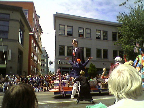
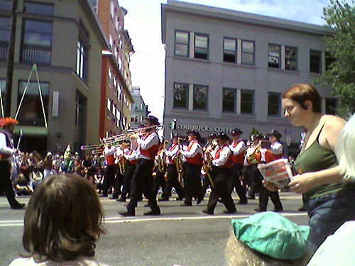
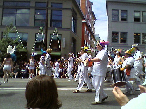
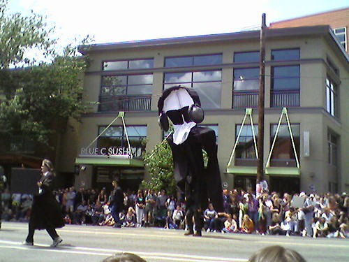
Fremont Fair 2006

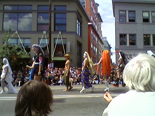
We had a lot of fun today at the Fremont Fair. What appeared to be a cool and cloudy day slowly became a sunny, warm one. The parade was (as usual) festive, musical, loud, and naked (painted, nude bike riders, that is).

Some pictures from the parade:

FremontFair (9)
The Sisters of Perpetual Indulgence were out in full force today.

FremontFair (11)
More than one papier-mache version of George W. Bush was on display.

FremontFair (10)
Go, marching band!

FremontFair (8)
The Brazilian band and dancers were quite good.

FremontFair (7)
This was supposed to be about spying. Looks more like a large Scream-masked individual to me.

FremontFair (6)
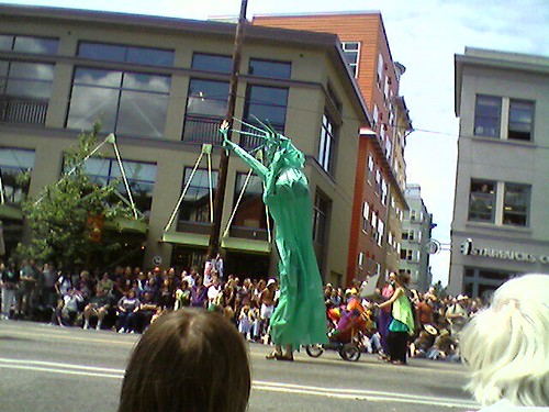
Statue of Liberty.

FremontFair (2)
Dancing, feathered people.

Post-Dinner Cupcake Royale

Nothing like a tasty box of cupcakes to bring home after a tasty dinner in Ballard.

As you can tell, they were busy tonight.
Line at Cupcake Royale

But, we scored a box nonetheless.
Cupcake Royale sticker

Yes, new camera phones are fun.

Sunday, June 11, 2006

Cheap Copper River Salmon At The Seattle Costco

The Seattle Costco has fresh, wild, sockeye Copper River Salmon filets for sale. The price? $9.99 a pound.

To compare, I saw some filets at Whole Foods for sale last week at around $30 a pound. Ack!

Saturday, June 10, 2006

Review: Black Gold (SIFF 2006)

Look down at your cup of coffee. Where was the coffee grown? How many hands touched the beans between field and barista? How much did the farmer get for those beans? What about the other food you eat; how does it measure up?

These are the questions Black Gold posits. While focused on the fair trade movement and its effects in a burgeoning Ethiopean coffee growers co-op, the theme resonates beyond coffee and forces you to question how and where the products we eat and buy come from, and how much the growers versus the middle men are earning for these products.

Black Gold reviews the efforts of Tadesse Meskela, the General Manager of the Oromo Coffee Farmers Co-operative Union. Tadesse's main focus is to remove the middle men between the coffee farmer and coffee roaster, and return more money to the farmer's pocket.

So, what's the problem with conventional coffee? In a sentence, the global price is set in commodities markets in New York and London, and no consideration is given to the local cost of living for a given farmer and his family. Currently, Ethiopian farmers get about $0.24 a kilo. A living wage for them would be about $2.00. That's still a very small price to pay to the grower given the cost of a pound of beans or an espresso drink here in the States, yet prices are kept low and farmers have to make do with a tenth of what they need. Furthermore, World Trade Organization talks in the past few years have failed to negotiate a fair price for coffee and other commodities for the Third World.

The result is that coffee, one of Ethiopia's most abundant natural resources, is sold for very little money. Farmers as a result don't have clean water, enough food, or good schools to send their children. Ironically, the film shows the amount of aid we give to countries like Ethiopia, and contrasts it with the little money we purchase their resources with. It also shows how a very small boost in the GDP of these countries would overshadow the amount of aid that we currently give them.

As a film, Black Gold is very well made. Excellent camerawork, editing, and a comfortable pace, combined with moving images of farmers and their families struggling to survive, make for a great documentary. Add to that the overall message and the information the documentary provides, and Black Gold becomes a movie most any Western consumer should watch.

Overall rating: 9.0 /10.0

Details:
Runtime: 82m
Country: United Kingdom
Language: English, Ethiopian, Italian

Cat 1, Bear 0

Who says you need a dog to protect you and your property? It turns out a cat can do just fine.

Greece #1

The folks over at Idea Grove decided to put together a whimsical Top 10 Countries list. Looking through it I agree with about 50-60% of it, except for one glaring (and easy to guess) opinion:

Greece should be #1 on the list.

I know, I know, it comes as expected from a Greek, right? But this list puts heavy weight on seminal and past achievements. So many of the countries on the list had big empires at one time or another, and thus had influence on the world (including Greece).

But Greece gave so many creations and inventions and ideas to the world that I do wonder why it's not above, say, the U.S. on the list. Sure, the U.S. is powerful, but it's a young country and hasn't had nearly enough time to provide the world with the same core value that countries like Italy or Egypt or China have had.

Oh well, I guess I'm biased, huh?

Monday, June 05, 2006

Review: Huldufolk 102 (SIFF 2006)

Huldufolk 102 is a captivating documentary about the superstitions that permeate Icelandic culture. The movie involves interviews with several people from various ages and walks of life, and offers slices of opinions, personal histories, and stories of the "hidden people" that abound in Iceland.

Who are the hidden people? Think fairies, elves, trolls, leprechauns, and other little people who are typically unseen but often talked about. They can be good and they can be mischievous. They live in rocks, but you can't see their homes in the rocks unless you're young or you have a gift of "seeing".

Seemingly everyone has an opinion about hidden people. The documentary does a good job drawing from various walks of life in interviewing locals about the Huldufolk. Both Christian and Pagan religious leaders are represented, as are farmers, teachers, scientists, political representatives, and villagers. They each have their own stories to tell and opinions to share.

Do people in modern Iceland believe in these people? Here's the interesting bit: while most people don't say they believe in them outright, at the same time they don't deny their existence. The reason? Many people have stories of unexplained phenomena, which drives the belief forward. For example, there are stories of people being cured of illness after asking for help, road equipment breaking down while trying to move large rocks to make way for asphalt, things disappearing only to reappear days later, and people seen running across a road only later to be seen in dreams.

One of the most gripping facets of the documentary is its depiction of the natural environment of rural Iceland. Rocks abound in valleys, jutting out here and there like miniature mountains. Mist is common in the mornings, adding a translucent light to the air. In one scene, an apparently real-time rolling of fog over a meadow is captured (which was shot in the glow of a midnight sun, we later found out from the directory).

The documentary doesn't set out to answer any of the questions posited regarding the existence of these little people, but does an excellent job immersing the viewer in the folklore and natural beauty of Iceland.

Overall rating: 8.5 /10.0

Details:
Runtime: 80m
Country: Iceland, USA
Language: English, Icelandic

Sunday, June 04, 2006

Lameness Alert #2: One Thousand Paintings

Soon after I posted about BuyMyDesktop.com, another lame site hits my radar. This one is admittedly SLIGHTLY less lame, but at the same time more infuriating.

The site: One Thousand Paintings. The product: One thousand blank canvases, painted with a blue number (1-1000, ascending). The price: Variable, starting at $40, with current prices in the several hundreds.

So, why is this lame? Sure, numbers are cool. But this artist is putting stenciled numbers on canvas and selling them for several hundreds of dollars.

  • The art is not original (numbers, letters, words, and shapes have appeared alone on canvas before).
  • It's impersonal (what part of the artist is in these paintings?).
  • It's extremely reproducible (give me a stencil, some blue paint, and some canvas and I'll make you one in 3 minutes).
  • It's very overpriced.
  • And, to my eyes at least, it's a shallow contrived way of getting lots of cash for not lots of work. Great for the capitalist in you, but where's the art in that?
I'm not one to decide what is and isn't art. But I'm also one to share my opinions of said art with anyone who cares to listen. And by golly I tell you this is just crap. But hey, hats off to the capitalist nature of this artist. I'm sure a pretty penny will be had for this unoriginal drivel.

That said, given copying is a form of flattery, I now announce: One Thousand Sticky Notes. I have 1000 of these babies with a number written on them. By me, personally! Stickiness not guaranteed. Each one's $10 plus shipping (none of this escalating price "because it's an experiment of art and mathematics" crap). Contact me if you want one. Here are some awesome pics of them.

Sticky note with a 1 written on it


Sticky note with a 29 written on it


Sticky note with a 347 written on it

    Thursday, June 01, 2006

    Jourgensen To Retire 'Ministry', Start Label

    Ministry, one of the first and longest-lived industrial bands, will soon produce their final album, followed by frontman Al Jourgensen moving on to managing his new record label.

    OK, so he has been at it for 25 years or so. I suppose it's OK to move on to new and different things.

    Just so long as you stay in the biz, OK Al?

    Tuesday, May 30, 2006

    Review: The District! (SIFF 2006)

    The District (Nyócker in Hungarian) takes a classic Shakespearean love story, adds some interesting animation, and covers it with a load of obscenities and vulgarity. The result is a visually appealing, if somewhat silly, animated feature that includes lots of tongue-in-cheek commentary on modern politics.

    We begin with an overview of life in a district of Budapest, complete with corrupt policemen, rivals between whites and gypsies, and kids who emulate their elders and want to be gangsters. Music ensues, and the kids begin some rapid-fire rapping and describe their situation in musical form.

    Soon, a plot emerges: one of the kids wants to get money to win his true love, so he and his science friend build a time machine, and a bunch of the kids go back in time. There, they put a bunch of dead mammoths in a crater, and (flash-forward) you now have oil! Now, you can sell the oil in the world market and make money. Right?

    If you have oil under you, people take notice. Enter folks like George W. Bush, Tony Blair, and Vladimir Putin and you have a political smorgasbord in animated form all wheeling and dealing to get a handle on that precious natural resource. If my review sounds scattershot, that's because the movie is as well.

    Frankly, I think the most interesting part of this movie was the animation. The bodies of the characters were 3-dimensional and moved in a smooth fashion, while the heads where rapidly-changing still images, which changed to represent the characters speaking, staring, or smirking. The effect was quite captivating, and it waffled between the construction-paper effect of animation like South Park versus the fluid movements of 3D rendered animation.

    The movie's fairly explicit, and definitely not designed for children. That said, if you're into animation, this one's unique (and funny) enough to warrant a viewing.

    Overall rating: 6.0 /10.0

    Details:
    Runtime: 87m
    Country: Hungary
    Language: Hungarian

    Sunday, May 28, 2006

    Review: The Death Of Mr. Lazarescu (SIFF 2006)

    Lazarescu is a movie that begins and ends in the middle of things, and focuses on the last day of a man's life as both his health and his familiar surroundings slowly decline. We open to see an ill-feeling Dante Lazarescu who, after feeding his cats, decides to call an ambulance to aid with his headache and stomach pain. We learn from the phone conversation that Lazarescu has had an ulcer surgery 14 years ago, that he drinks copiously (much to the dismay of the people on the other end of the line), and that he clearly needs some form of help (judging by the etched lines of pain in Lazarescu's face, and his fits of vomiting).

    With the help of his neighbors, a paramedic arrives. At first, she is fairly indifferent, and attributes Lazarescu's problems to his drinking. She starts suspecting a more serious issue is at hand with his health, however, after witnessing his condition, and decides to take him to the hospital.

    Thus begins a night of medical red tape and doctor-patient conflicts for Lazarescu and the paramedic. They get shuttled from hospital to hospital, in part because of a serious bus accident eating away at all available hospital resources, and in part because no one wants to deal with an apparent drunkard who just needs to sleep things off. As Lazarescu moves from doctor to doctor, we slowly learn that his condition is quite serious, and we watch him deteriorate to the point of needing emergency surgery. At which, the movie, rather abruptly, ends.

    Death is certainly a main theme of the movie. The entire movie takes place at night, with on-again off-again rain smattering the windshield of the ambulance that Lazarescu and the paramedic use to drive from hospital to hospital. We witness the horrible aftermath of the bus accident as patients are shuttled through the hospital hallways. We learn that Lazarescu's wife has died several years earlier of cancer. And, we witness Lazarescu's own decline into apparent death.

    However, another theme is the sarcasm of the modern medical profession, and the attitudes and behaviors between doctor and patient, and doctor and non-MD medical staff. We witness the paramedic initially being indifferent to Lazarescu and assuming he's just a drunkard having a bad night. But as she suspects something more serious is at hand, she becomes the voice of Lazarescu to the various doctors she encounters. The doctors are constant skeptics, and they purvey a caste system of "doctor knows right", despite the fact that the paramedic has been with Lazarescu all night and has a history with him (and with prior doctors). The doctors are portrayed very negatively in this movie, with their attention spent mostly on moving people through the medical machinery, making personal phone calls, and fetching food. I could hear the audience utter frustrated sighs as we witnessed doctor after doctor trying to hand off Lazarescu to someone else rather than really focus on him, his condition, and his history like you would expect a doctor to do.

    Visually, the style of this movie is similar to a documentary, with most of the camera work appearing to be hand-held. However, the lines are clearly scripted, with actors rarely interrupting each other or being at a loss for words as a "real" documentary would portray. Still, the movie does an effective job of capturing the moment without intruding into it, and without trying to be overly poetic or romantic about the situation (music is almost completely devoid from the movie, save for opening and closing credits and an ambient television here or there). Lazarescu isn't a feel-good movie and doesn't have a clear beginning-middle-end that a traditional story-arced film would, but it's nevertheless worth a viewing, if only to contrast those forms of filmmaking with an interesting alternative.

    Overall rating: 6.5 /10.0

    Details:
    Runtime: 153m
    Country: Romania
    Language: Romanian

    Lameness Alert: BuyMyDesktop.Com

    Sure, the Million Dollar Home Page was pretty ingenuous. But Buy My Desktop? Sorry, I don't think so.

    Pay $25 to get a shortcut on one person's computer desktop. That's only seen by that person. Great, wow, awesome, thanks!

    Just so everyone knows: I'm selling a cubic inch of space on my dresser for anyone who wants to place an item there ($10, must be non-volatile). Also, you can put a sticker on my computer mousepad ($20, no larger than 1" square) if you want, or even let me affix a sticky note to my computer monitor with whatever you want written on it ($50, not guaranteed to be sticky forever).

    Saturday, May 27, 2006

    Start Your (SIFF) Engines

    It's SIFF time! And, it's rainy, so I don't feel TOO bad spending some time seeing movies during Memorial Day weekend. Let's go!

    This blog will take on a bit of a movie-review tone during the next few weeks, as we watch and then talk about some of the movies in the festival. Fear not, after the movie craze is over we'll return to regularly-scheduled programming.

    Friday, May 26, 2006

    Web 27.0 Is Mine!

    OK, with all the controversy around O'Reilly's registration of "Web 2.0" as a service mark, I want to make a public statement.

    Today, May 26th, 2006, I'm laying claim to the following trademark: "Web 27.0". Right around the time we're ready to release the 27th version of the Web (or at least proclaim the fact that we are), call me up before those conferences get scheduled. You're going to need to pay me some royalties!

    No, seriously guys. Web 27.0. It's mine. Talk to my lawyers.

    And no, you can have Web 26.0, Web 27.1, even Web 1897.948. 27.0 is where it's at. Seriously.

    Sunday, May 21, 2006

    Cal Anderson Park Images

    Cal Anderson Park is a great place to visit during these warm months. Formerly an above-ground, fenced-in reservoir, the city transformed the space into a public space complete with fountain, playground, and lots of grass to do with what you will.

    The folks over at VRSeattle have posted some QuickTime VR "virtual" shots of the park. They've got plenty of other nice VRs of Washington up there, if you're looking for a virtual tour of the area.

    Picture of Cal Anderson park

    Saturday, May 20, 2006

    Seattle Pug Gala

    We love pugs. We don't have one, but many of the folks in our neighborhood do. We see them getting walked and romping in the park all the time. We think they're some of the cutest dogs around.

    And, who knew there was a Seattle Pug Gala on? It's a benefit for the Seattle Pug Rescue. Great pics on both sites, if you're a fellow pug aficionado.

    Sunday, May 14, 2006

    SIFF 2006

    Yes, the Seattle International Film Festival is coming. Yes, just when the weather is warming up, Seattleites rush indoors to watch movies. Anyway, we're heading down today to purchase our tickets.

    We're being a bit more reserved this year, scooping up on the order of 10 films (rather than our usual 16-18).

    As with last year, I'll write up some reviews of the movies we watched, after the fact.