I find myself twittering more and more and blogging less and less. Twitter is filling the gap in terms of short, to-the-point, and timely statements about what I'm doing or thinking about. Blogging is good for longer thoughts, or sharing media (pics).
I haven't had a whole lot of time lately to do the latter, but the former lends itself to just a moment or two of time. As such, if you care to follow me on twitter, I'm zorbadgreek.
Monday, July 28, 2008
Tuesday, July 22, 2008
Photo: Galileo with sheep
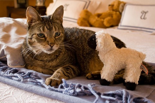
Oh yes, Galileo loves his sheep. Really. Can't you see it in his eyes? That look of gleeful happiness and giddy joy?
Yeah, OK, so we put it on him and snapped a photo, and he wasn't that amused.
Sunday, July 06, 2008
Photo: Gasworks
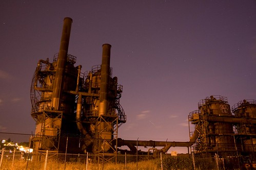
Nighttime photos are cool. Depending on ambient light and shutter speed, you get some interesting effects. This was 15 seconds at 11pm, with an orange street lamp from the left hand side in the distance.
Friday, July 04, 2008
Photo: Lick
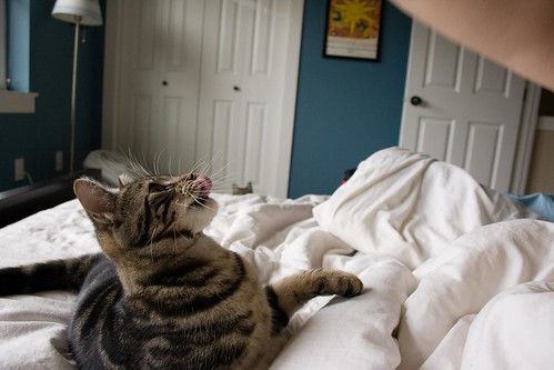
Gus is growing, but he's still a kitten. We were playing with him on the bed not too long ago, and he was rearing to go. This shot caught him with his tongue licking his nose, in between pounces.
Ugly Web Site Alert: SeattleGrapeVine.com
There's never a loss of ugly web sites. But some rise above others. Check out SeattleGrapeVine.com.
Immediately one sees the haphazard nature of the site. It approaches a ransom note: different fonts, colors, backgrounds, and effects as one goes from region to region on the page. As one clicks around, you see a ton of ads spread around a tiny bit of content: a few events here, a classified there.
Why would someone want to stick around on this site, much less use it? It hurts my eyes just to try.
Wait, it gets worse. There's apparently lots of Grapevine sites out there. Including ones worse that this one. Check out RochesterGrapeVine.com. Or don't. It crashed my browser a few times.
Why do sites have to be this ugly? And for those running these sites, why do they think this is an acceptable user interface?
I'm not saying web site design is easy. But that's no excuse for living with a bad design.
Subscribe to:
Posts (Atom)